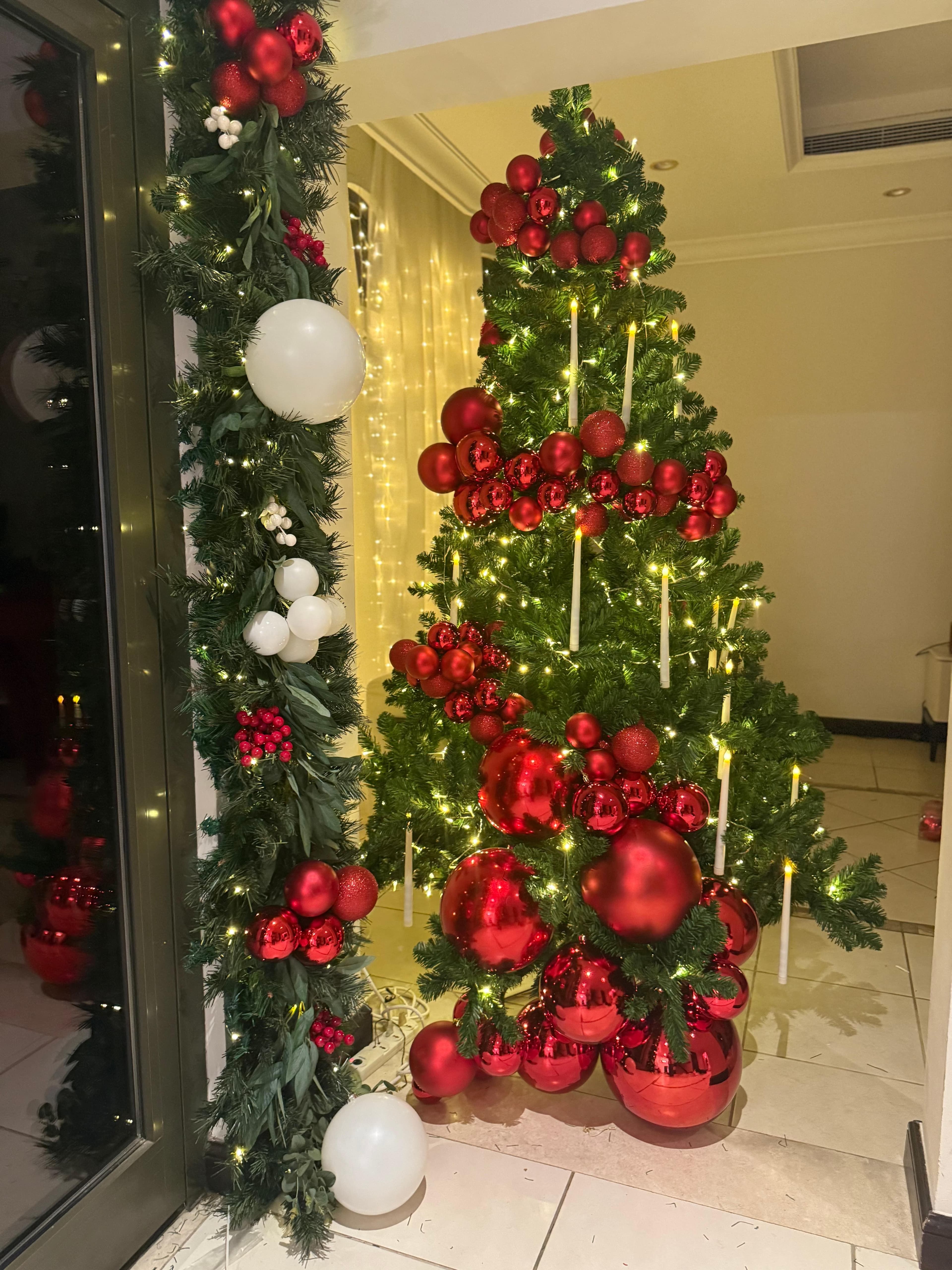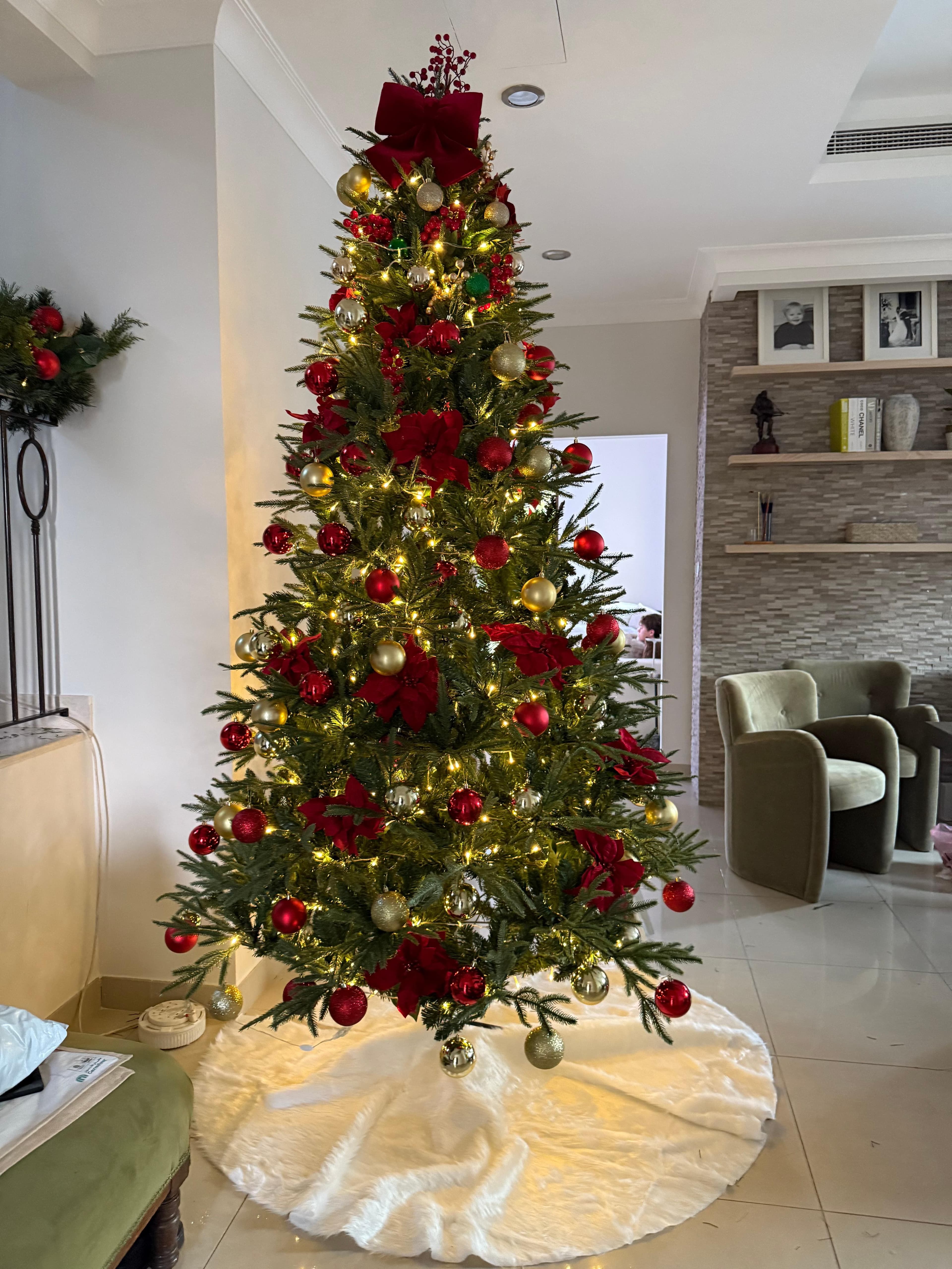
A festive palette is not decoration trivia — it decides how the whole room reads in December. The same tree, garlands and table styling can feel traditional, contemporary or quietly luxurious depending entirely on the colours you commit to.
Pure White & Winter Wonderland
White schemes — our Pure White and Winter Wonderland directions — lean into the light and airiness of modern villas. They photograph beautifully, keep a room feeling open, and work especially well in living areas with marble, pale joinery or floor-to-ceiling glass.
Luxury Gold
Gold adds warmth and richness without the busyness of a multi-colour scheme. A gold-dressed tree with champagne accents complements darker interiors, evening lighting and formal dining rooms — it is the direction clients most often choose for a statement entrance or a grand living space.
Rose-gold and custom palettes
Rose-gold sits between the two — soft, contemporary and flattering under warm light. Beyond the fixed directions, every scheme can be composed around a custom palette to match your interior, brand or occasion. Ornament sets are built for the palette, so the colour reads consistently from the tree to the garlands and table styling.
Choosing for your space
A simple rule: match the theme to the room you are dressing, not to trends. Browse our gallery to see real installations in each direction — then, when you are ready, send photos of your space on WhatsApp and we will recommend the palette that fits your interior and confirm what it would cost.